If you Google “goals of professional services firm’s websites” or “what should professional services firms websites do” you’ll likely get something like the following five objectives. For example, that your website should:
- demonstrate the depth of your expertise via practice group pages and personable fee earner biographies, both closely linked to articles (“show, don’t tell”)
- match claims you and your referrers make to differentiate your firm (if it’s key that you’re ‘innovative’ then perhaps your website shouldn’t look like everyone else’s)
- provide key functionality like phone and email addresses for your fee earners and office locations
- attract clients through appropriate search engine optimisation via articles you write (people searching typically have an issue they need an advisor for)
- provide art therapy for creatively inclined partners (Ok, we just liked the sound of this)
What about understanding the market?
You will rarely see in lists of website objectives for professional services firms using your website to learn about your market (in reality this should be number 5).
In working on dozens of analytics projects for professional services firms’ websites, even the smallest firms see 10,000 unique visitors a year and large firms see hundreds of thousands, right up to single digit millions for the largest global firms.
Given that every time someone visits your website your webserver is looking over their shoulder – at how many times they’ve visited, the sequence of pages, and where they came from (all in the basic version of Google Analytics most firms have) – you’d think that learning about the market might at least rate a mention. Having a survey completed by 100,000 people a year for free certainly contrasts with spending $15,000 dollars on formal market research with just a few dozen clients.
Yet typically analytics isn’t mentioned as a key objective.
Why website analytics is usually omitted from the planning process for website redesigns – or added as an afterthought
There are two main reasons this happens: firstly a misconception that website analytics is mainly for e-commerce sites (“it’s not as if we’re Amazon”) and secondly a lack of appreciation of what good website analytics can actually do for you.
For example a good analytics implementation and reporting build can tell you:
- what prospective clients value the most (by looking at actions in sequence over a visit)
- what issues prospects are thinking about (using articles as market research tool and reviewing metrics)
- what individual fee earner business development pipelines look like and how each is being contacted
- which specific practice group pages/bios/articles are working best on your site and which need changing
- what companies are visiting your site anonymously
And that’s only a partial list.

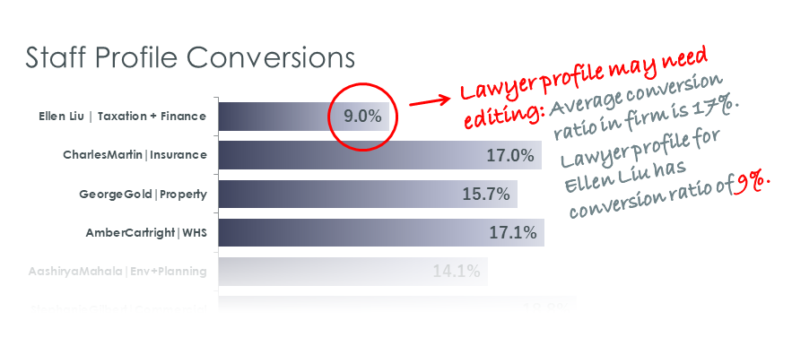
Being able to see what proportion of the people that visit each individual fee-earner’s profile actually contact them
Why can’t I worry about analytics later – after I’ve built our new website?
The short answer is: you can.
But (you knew there was a ‘but’) it will cost you more than incorporating it in the approved website design to start with, and until the design work is (re)done you will not be tracking the most important things that happen on your website (like being able to see 100% of contact with individual fee earners) as that is not included in both your default analytics implementation (usually Google Analytics) or your site design.
And yes, you’ll likely have to renegotiate look and feel with the relevant stakeholders (again). Why would anyone want to do that? Website redesigns typically involve a number of significant challenges already.
How do you achieve the right analytics outcome in a website redesign?
The most important thing to keep in mind is that you want to be able to track the highest value activities like people contacting your lawyers through your website. Most professional services firms fail to track fee-earner contact at all and the few that do only manage partial tracking – so don’t just model your new site on some other firm’s website you happen to like the look of.
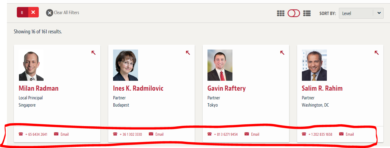
The classic mistake stopping professional services firms effectively tracking people contacting them, is to put contact details for fee earners and the firm everywhere, rather than in ways you can track like through the Contact Us page (fee earner profiles are a special case which we’ll consider in a minute). From boutique firms to global firms only 1 in a 100 is currently set up to correctly track contact in the way it should be tracked (after you’ve read this article check out some of your competitors to see how they measure up).
If you want to be able to look across a visit in your analytics and see when someone actually contacts you, you need to design your website with that in mind. So for example if you put your phone number in the footer of every page you will never be able to see when someone calls you.
Here’s a typical lawfirm website footer (you will find advice all over the web telling professional services firms to structure page footers precisely like this):
This is not good advice. An effective website analytics implementation typically requires a click to track something (no click = no clue).
The ‘Contact Us’ page is a very well known web convention – people can easily go there with one click from every page on your site. Having fixed these footers in analytics projects with many firms we can safely tell you that you won’t get less phone calls just because you don’t have your phone number or email address on every page.
The same thing goes for contact details in articles:
And search results:
It doesn’t matter what page we’re talking about (practice group pages?): remove those contact details unless they are on a fee earner profile page or the ‘Contact Us’ page on your website.
By doing so you are setting up the foundation to understand which articles, profiles, external channels or other promotional activities actually cause someone to contact your firm.
Fee earner profiles: a special case
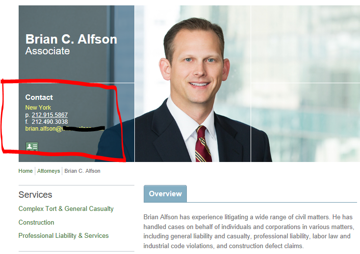
Clearly you must have contact details (email address, phone and others) on fee earner profiles so clients and prospects can contact that specific fee earner.
First, here’s the way most professional services firms do it (in this case a law firm):
Instead, you should be doing something like this (one option but we can give you other examples that achieve the same thing):
In order to reveal George’s contact details (email, phone number etc) the website user simply clicks the button next to ‘Contact George’ and that reveals George’s contact details (email, phone, etc). George’s contact details are already loaded in the page so there’s no wait time for the user: clicking the button just shows them (and with the right analytics implementation enables you to track that someone has just tried to contact George).
Those simple changes, that just require an hour or so of web developer time, lay the groundwork to enable you to understand literally 100% of contact with fee earners that occurs through the website.
Contacting a fee-earner is something we class as a high value activity in our analytics projects: read about other high value activities here, why they are important, and the next steps to take to be better informed than your competitors about the opportunities in your market, and your fee earners, via your website’s analytics.


